Google Maps now diplays Air Quality Index for Android and iOS
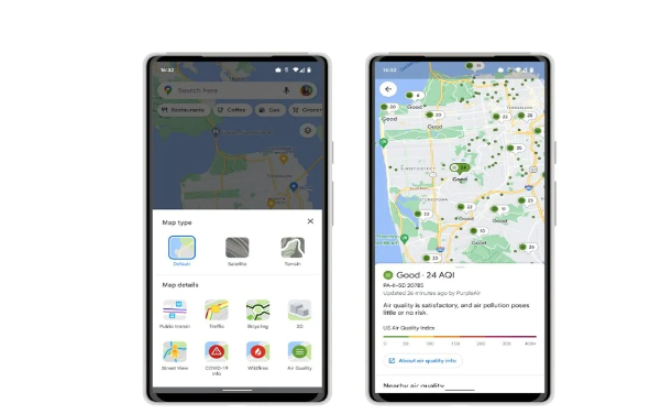
Google Maps now displays air quality index (AQI) statistics on Android and iOS, similar to Nest Hubs and the Pixel’s At a Glance widget. This innovation, which was first shown off last year, adds a new map layer that can be accessed by touching the circular button just beneath the search bar and suggestion carousel. Along with Public transit, COVID-19 information, and Wildfires, the green Air Quality icon displays in the bottom-right corner.
This will tell you whether the air is smoggy, smoky, or otherwise awful, or whether it is absolutely wonderful.
You can make better-informed judgments about whether or not to go outside, and if so, for how long, now that you have these facts at your fingertips. You’ll see AQI (Air Quality Index) values, as well as outdoor activity recommendations, the date the information was last updated, and links to learn more.
Over the larger sites, pins will emerge, and you can tap any color-coded dot to see a specific spot. On the bottom sheet, there are further details and an easy-to-understand language description.
According to Google, this data originates from reputable government bodies, such as the US Environmental Protection Agency, and is intended to assist users in making more informed decisions about whether or not it is safe to go on a trek or engage in other outdoor activities. Google will display air quality data from Purple Air, a low-cost sensor network that provides a more hyper-local perspective of conditions, in addition to data from government agencies.
PTA Taxes Portal
Find PTA Taxes on All Phones on a Single Page using the PhoneWorld PTA Taxes Portal
Explore NowFollow us on Google News!