Xiaomi Unveils New Logo and Brand Identity

After successfully launching the Mi 11 series and Mi Mix Fold, the company announced another non-tech announcement on stage. The new Xiaomi logo is here and it brings a brand new “Alive” branding identity. A Japanese graphic designer, Kenya Hara, has designed the logo. He is a professor of Musashino Art University and the President of the Nippon Design Center (NDC).
Xiaomi Unveils New Logo and Brand Identity
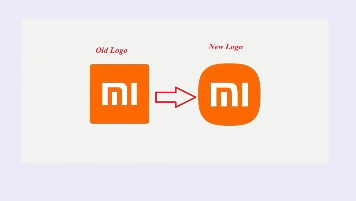
The big change in the new logo is its rounded edges. There’s also the new MI typography which adds a more pleasing look to the company’s name next to the logo. Xiaomi specifies that it wanted a more graceful look to its brand identity and one which symbolizes its energetic nature heading into the next decade.
The corporate colour remains orange to continue to convey the liveliness and youthfulness of Xiaomi. Black and silver will also be used as supplemental colours to accommodate high-end product line applications.
Check Also: Xiaomi Mi 11 Ultra is Now Live with Two Screens and Powerful Camera Sensors
The concept of Alive is Xiaomi’s thinking and response to the turning point in the era of intelligent interconnectivity.
Xiaomi CEO, Lei Jun, said
“We didn’t just change the shape from square to round but also changed the internal spirit as well as the mentality of the brand.”
PTA Taxes Portal
Find PTA Taxes on All Phones on a Single Page using the PhoneWorld PTA Taxes Portal
Explore NowFollow us on Google News!


