WhatsApp Web Gets A New Look To Make Navigation Easier
WhatsApp is no doubt one of the most popular messaging apps out there. It keeps on coming back with new features and designs to engage users. If you use WhatsApp on a tablet or PC, you know it’s just a bigger version of the WhatsApp phone app. However, now WhatsApp is going to spice things up! You must be wondering how. Recently, some sneaky leaked screenshots showing a revamped sidebar for ‘WhatsApp Web’ surfaced online. The all-new sidebar is meant to make navigation easier and quicker. This WhatsApp feature is in the beta testing phase currently so, the rest of us will have to wait.
WhatsApp Web Is Getting A Revamped Sidebar
According to WABetaInfo, WhatsApp is rolling out a new sidebar for web users. The messaging giant aims to give users better navigation, more intuitive design, and faster access to important sections. Unfortunately, the revamped sidebar is only available for beta testers. However, soon it will make its way to other users as well. The new sidebar has been in testing since last year. The good part is that it’s slowly making its way to the surface in the latest beta update.
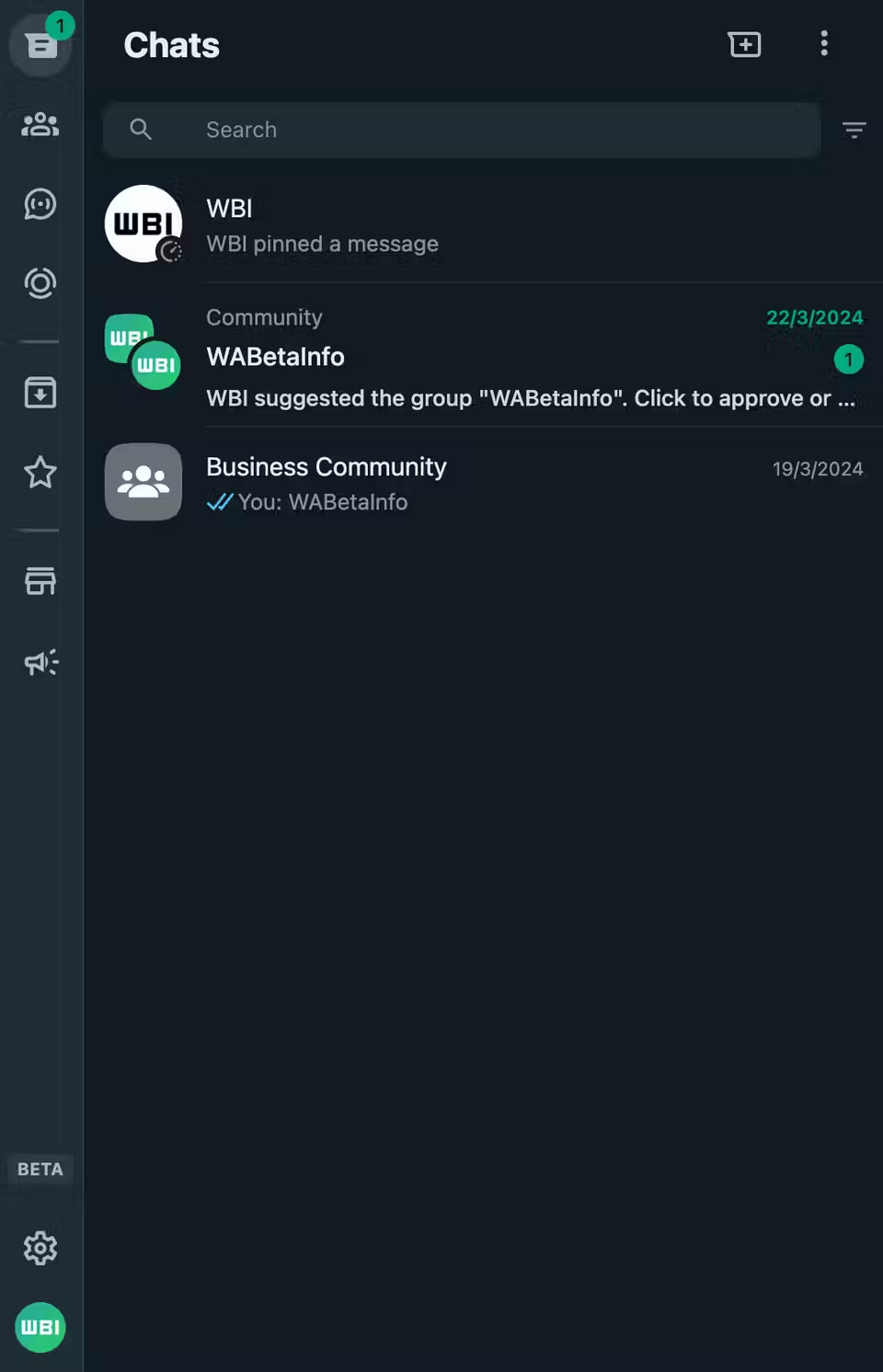
Beta testers will see the all-new sidebar with WhatsApp Web beta 2.3000.1012734542. Due to this new shiny look, they will have easy access to Channels, Chats, Archives, Communities, and Starred Messages. If you don’t see the changes just yet, don’t worry! It will roll out in the coming weeks.
Most Significant Changes
- WhatsApp’s horizontal bar, normally located in the green banner at the top of the screen will be at the bottom. It will accompany the “Discussions”, “News”, “Communities” and “Calls” tabs to “make it easier to access what you need when you need it”
- The interface redesign further expands to the call screen – when you’re in the middle of a phone conversation. Some new buttons in beta version 2.23.17.16 have been discovered. For instance, the “Back” button has been replaced by a “Minimize” button. It provides greater clarity and avoids giving the impression that the call is about to be ended. The bottom bar has more pronounced icons, with five instead of four: menu, video call, speakerphone, microphone, and hang-up.
- The “Decline” and “Accept” buttons take up more space, especially in terms of width, and come with new colors.
PTA Taxes Portal
Find PTA Taxes on All Phones on a Single Page using the PhoneWorld PTA Taxes Portal
Explore NowFollow us on Google News!