Google Calculator Material Theme Redesign Rolling Out to Users
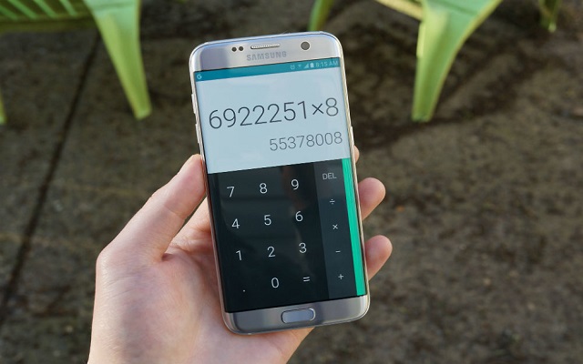
Google showed off its Calculator Material theme redesign at I/O 2018. No doubt the design was pretty good and finally Google Calculator Material Theme redesign is rolling out to many apps and services. Previously Google had added new looks to Chrome, Android Messages and more and finally its Calculator app has a makeover. The dark number pad and pull overshadow is replaced light grey and transparent window.
The material theme of google is rolling out to users now which means soon you will have an update available on play store. If you have not received the update, don’t’ worry as it is rolling out in chunks.
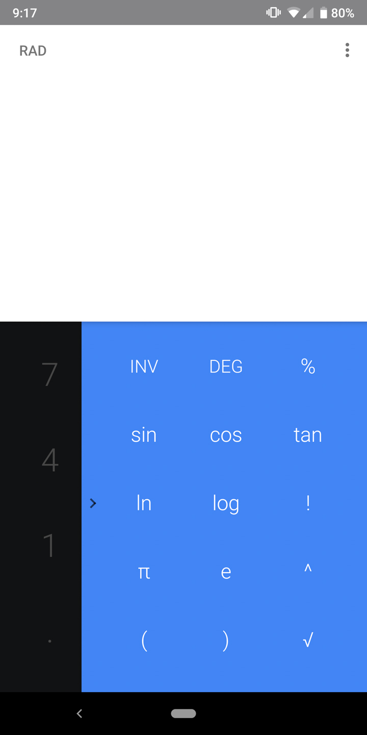
New Design:

Old design

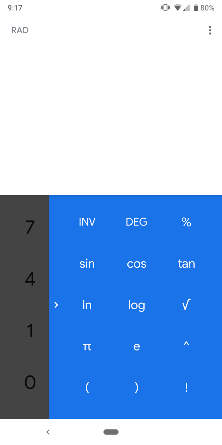

The above screenshot shows the comparison that how Google has changed the hues of blue colour in the overflow menu and has switched to Google’s product Sans font. Now the graphics and symbols are much bolder and are prominent than the other elements in the app.
Some other little changes include the phone’s navigation bar which automatically gets white while using the app and changes its position of the “0” and “.” characters.
Do you like the new Material Theme redesign of the calculator? Let us know in the comments below.
Also Read: Apple Removes Calculator% App Used by Teenagers to Hide Porn Photos & Videos
PTA Taxes Portal
Find PTA Taxes on All Phones on a Single Page using the PhoneWorld PTA Taxes Portal
Explore NowFollow us on Google News!