Facebook Reveals New Logo – But Can You Tell the Difference?

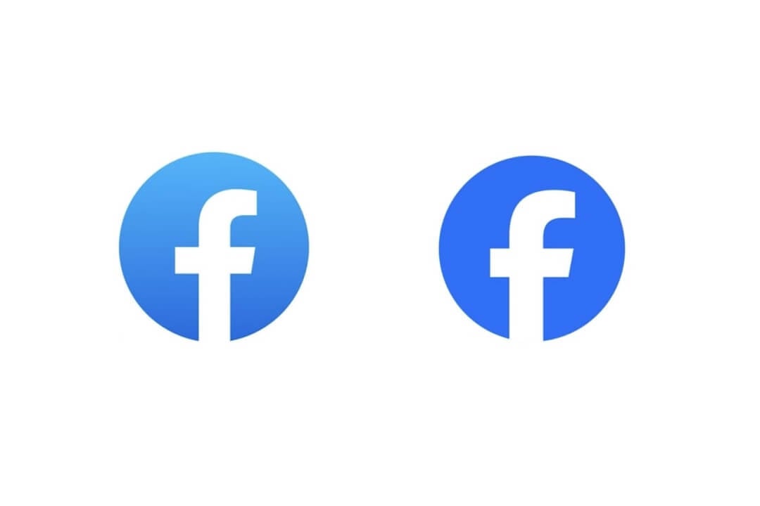
Meta, the parent company of Facebook, has unveiled a new yet significant change to the social media giant’s logo, aiming to create a “bolder, electric, and enduring” design. The primary alteration involves a shift to a darker shade of blue, with some minor adjustments.
In explaining the logo update, Facebook emphasized the enhancement of its core blue colour, resulting in a more confident appearance. Specifically, the lowercase “f” in the logo was modified to provide better visibility within the app, with improved contrast to make it stand out.
Facebook Reveals New Logo – But Can You Tell the Difference?
Dave N, Director of Design at Facebook, expressed the company’s goal of maintaining a sense of familiarity while infusing a dynamic, polished, and elegant touch into the refreshed logo. These nuanced changes were aimed at achieving an optimal balance and conveying a sense of progress.
Facebook identified three key drivers behind this logo evolution. It includes a desire to elevate the brand’s most iconic elements and establish an expansive colour palette anchored in blue. Over the years, Facebook’s logo has evolved from one with square boundaries to its current circular design.
The new logo utilizes the company’s custom typeface, “Facebook Sans.” It introduces a redesigned wordmark and logo to enhance overall legibility and ensure consistency.
The new design sparked some confusion among social media users. Facebook clarified that it has also developed a new colour palette, incorporating various hues, tones, and contrast ratios. This broader tonal range in secondary blues allows for greater flexibility while maintaining a balanced representation of the brand identity.
Facebook announced that further refinements are in the pipeline for elements such as reactions, typography, and iconography. All with the aim of providing a more coherent, personalized, and seamless experience for its vast user base.
Meta hinted at additional changes on the horizon, describing the recent logo tweaks as the “first phase of a refreshed identity system” for the app, suggesting that more updates and enhancements can be expected in the coming days.
PTA Taxes Portal
Find PTA Taxes on All Phones on a Single Page using the PhoneWorld PTA Taxes Portal
Explore NowFollow us on Google News!


