New Twitter design takes a bit of getting used to of it
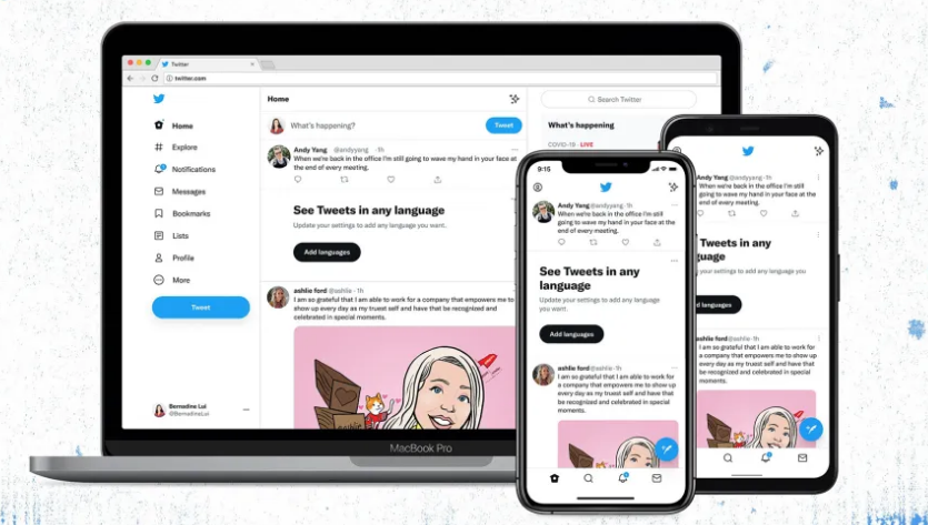
Twitter has announced a number of design changes today, all of which are aimed at making the Twitter experience more accessible. A new Twitter design, adjustments to the UI colours, high contrast buttons, and redesigned ‘Follow’ button and more are among the improvements.
However, there has been at least one big snag with the makeover for 2021. The new Twitter design The “Follow” and “Following” buttons on Twitter have been redesigned in the new version. In a nutshell, the “Following” button is the same colour as the app’s backdrop, and it appears just like the old “Follow” button.
RELATED: Twitter Rolls Out Auto Captions for Voice Tweets
i dont care about the font but the follow button changing to filled in when you aren't following is very confusing. why
— Bec Shaw (@Brocklesnitch) August 12, 2021
The follow and unfollow button states should be reversed and you cannot change my mind pic.twitter.com/LhnIbmmxoP
— Kelly Vaughn (@kvlly) August 12, 2021
Many people have expressed dissatisfaction with the new design. There have appeared to be a slew of unfollows that were supposed to be follows. There have been a lot of tweets about it, to be honest.

CHIRP Feature
The most noticeable update is a new typeface called Chirp, which the firm claims makes Twitter “more approachable, distinctive, and focused. Twitter also says that all text in western languages now aligns to the left, making it simpler for users to read as they scroll, while non-western languages remain unaltered. Furthermore, the firm claims that new colours will be released shortly, giving consumers a new palette to select from.
At the same time some feel hard to use this new Font feature.
I want to give a bit more depth to Chirp, our new typeface.
Type, in 280 character doses, is the foundation of Twitter. In the history of the company we’ve either relied on someone else’s typeface, from SF Pro and Roboto, to Helvetica Neue in our brand. pic.twitter.com/OrvlYsxF9g
— Derrit DeRouen (@DerritDeRouen) January 27, 2021
Same. I can't believe they claimed this would be easier to read because it is definitely much harder to read
— Tango (@tangozlulu) August 11, 2021
A Color Pop
Another new change is the website’s colour scheme. Follow buttons are now black in standard mode and white in dark mode, when they were previously available in a choice of hues.
The site’s design account stated, “Our new buttons are also high contrast.” “At this point, the most critical acts you can do stand out. The follow buttons may appear different, but they will assist you in seeing what you want to view.
Emoji Button
The most significant change are little shortcuts that make tweeting more convenient. A huge, dedicated emoji button appears in the tweet box, an updated trending section appears on the right-hand side of the page, and minor visual changes make it easier to identify who’s in a conversation.
A new https://t.co/fHiPXozBdO is coming.
Some of you got an opt-in to try it now. Check out the emoji button, quick keyboard shortcuts, upgraded trends, advanced search, and more. Let us know your thoughts! pic.twitter.com/G8gWvdHnzB
— Twitter (@Twitter) January 22, 2019
Twitter has received its much-anticipated design update, which includes a slew of new features, some of which you may like or dislike. Overall, the new Twitter design isn’t awful and adds some much-needed freshness to a UI that had become a little stale.
The new Twitter interface will be available on iOS, Android, and the web starting today. Is the new Twitter typeface visible on your devices?
PTA Taxes Portal
Find PTA Taxes on All Phones on a Single Page using the PhoneWorld PTA Taxes Portal
Explore NowFollow us on Google News!